
技術者の英語会議では、プレゼン資料にはグラフや表が必ず出てきます。
グラフや表について説明したり、気になる点を質問したりすることは、日本語では容易ですが、英語になると途端に難しくなります。
本稿では、実際のグラフを見ながら、実用的な説明・質問のフレーズを紹介します。
共通して使えるフレーズ
散布図、時系列、ヒストグラムなどそれぞれについて具体的な説明方法を紹介する前に、グラフの説明・質問に共通して使えるフレーズを紹介します。
説明に使えるフレーズ
| English Phrase | Japanese Translation |
|---|---|
| The graph shows… | グラフは…を示しています。 |
| The x-axis/y-axis represents… | x軸/y軸は…を表しています。 |
| Each point/line/bar indicates… | 各点/線/バーは…を示しています。 |
| As seen on the graph… | グラフに見られるように… |
| There is a trend of… | …の傾向があります。 |
| The data suggests that… | データは…を示唆しています。 |
| The peak/dip in the graph… | グラフのピーク/低下は… |
| There is a correlation between… | …の間に相関があります。 |
| The graph illustrates the relationship between… | グラフは…の関係を図示しています。 |
| The most noticeable feature is… | 最も顕著な特徴は…です。 |
質問に使えるフレーズ
| English Phrase | Japanese Translation |
|---|---|
| Could you explain… | ~を説明できますか? |
| What does… represent? | ~は何を表していますか? |
| How were… determined? | ~はどのように決定されましたか? |
| Are there any…? | ~はありますか? |
| How does… affect…? | ~は~にどのような影響を与えますか? |
| What is the significance of…? | ~の意義は何ですか? |
| Is there a reason for…? | ~の理由はありますか? |
| How reliable are…? | ~の信頼性はどの程度ですか? |
| Can you provide insights into…? | ~についての洞察を提供できますか? |
| What are the implications of…? | ~の意味するところは何ですか? |
散布図(scatter plot)
グラフを説明する
| 英語 | 和訳 |
|---|---|
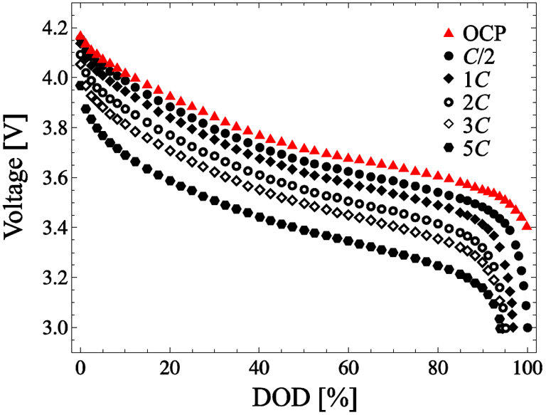
| This graph is called a discharge curve. | このグラフは放電曲線と呼ばれる |
| The x-axis shows depth of discharge in percentage, and the y-axis shows voltage. | X軸は放電深度(DOD)を%で示し、Y軸は電圧をボルトで示す。 |
| Different symbols show how fast the battery loses power. | 異なる記号は、バッテリーが電力を失う速さを示しています。 |
| The OCP is marked by red triangles. | OCPは赤い三角で示されている。 |
| As DOD increases, the voltage drops. | DODが増加すると電圧が低下します。 |
このグラフについて質問する
| 英語 | 和訳 |
|---|---|
| Could you explain why the voltage drop for the OCP is more gradual compared to the other discharge rates? | OCPの電圧降下が他の放電レートと比べて緩やかなのはなぜですか? |
| At what point on the curve do you consider the battery to be fully discharged? | カーブ上のどの時点でバッテリーが完全に放電されたと見なしますか? |
| Is there any specific reason why the discharge rate curve begins to drop more steeply around 80% DOD? | 放電率曲線が80%DOD付近でより急に下がり始めるのは何か特別な理由があるのでしょうか? |
| How does temperature affect these discharge curves? | 温度はこれらの放電曲線にどのような影響を与えるのか? |
| Are these results for a standard temperature? | これらの結果は標準的な温度でのものなのか? |
| Were there any external factors, such as battery age or cycle number, that might have influenced these discharge characteristics? | これらの放電特性に影響を与えたと思われるバッテリー年齢やサイクル数などの外的要因はありましたか? |
| Do batteries usually lose power this fast when they’re almost empty, or is it just this one? | バッテリーがほとんど空になると、普通はこんなに早くパワーが落ちるものなのか、それとも今回だけなのか? |
時系列データ(time series data)の説明
グラフを説明する
| 英語 | 和訳 |
|---|---|
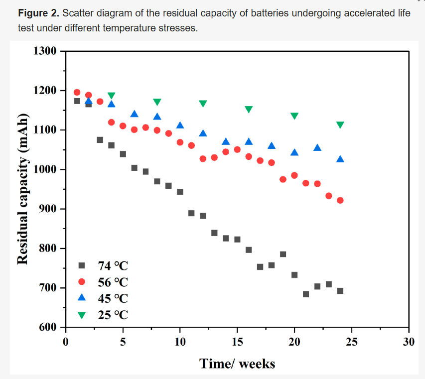
| This graph is a scatter plot that tracks battery life over time under different temperatures. | このグラフは、さまざまな温度下でのバッテリー寿命の経時変化を追跡した散布図である。 |
| The x-axis represents the test period. | X軸は試験期間を表している。 |
| The y-axis shows the residual capacity of the batteries in milliampere-hours. | Y軸はミリアンペア時(mAh)でバッテリーの残存容量を示す。 |
| Different shapes and colors of the points indicate the temperature conditions the batteries were tested under. | 点の形と色の違いは、電池が試験された温度条件を示している。 |
| Squares represent batteries tested at 74°C, circles at 56°C, triangles at 45°C, and inverted triangles at 25°C. | 正方形は74℃、円は56℃、三角形は45℃、逆三角形は25℃でテストされた電池を表す。 |
| A higher placement on the y-axis means more remaining battery capacity. | Y軸の位置が高いほど、バッテリーの残容量が多いことを意味する。 |
| Time advances along the x-axis from left to right, demonstrating the battery’s wear over time. | X軸に沿って左から右に時間が進み、バッテリーの経年劣化を示す。 |
グラフについて質問する
| English Question | 和訳 (Japanese Translation) |
|---|---|
| Why does the battery capacity decrease more rapidly at 74°C compared to the other temperatures? | 他の温度に比べて、74°Cでのバッテリー容量がより急速に減少するのはなぜですか? |
| Is the loss of capacity linear with time, or does it accelerate after a certain threshold? | 能力の低下は時間とともに直線的に進むのか、それともある閾値を超えると加速するのか? |
| How accurately do these temperature stress tests reflect real-life battery usage and conditions? | これらの温度ストレステストは、実際のバッテリーの使用状況や状態をどの程度正確に反映していますか? |
| Could you explain the methodology behind the accelerated life test? | 加速寿命試験の背後にある方法論を説明できますか? |
| Was there any difference in the type or brand of batteries used across the different temperature tests? | 異なる温度テストで使用されたバッテリーの種類やブランドに違いはありましたか? |
| How might these findings influence the design of new batteries? | これらの発見が新しいバッテリーの設計にどのように影響を与える可能性がありますか? |
| Are there any plans to test at temperatures below 25°C? | 25°C以下の温度でテストを行う予定はありますか? |
| Is 25°C considered a standard low-temperature stress test for these batteries? | 25°Cはこれらのバッテリーにとって標準的な低温ストレステストと見なされていますか? |
ヒストグラム

このグラフを説明する
| 英語 | 和訳 |
|---|---|
| This graph is a histogram that shows the distribution of battery cell capacities. | このグラフはバッテリーセルの容量分布を示すヒストグラムである。 |
| The x-axis lists the capacities of the cells in ampere-hours. | X軸はセルの容量をアンペアアワー(Ah)で表しています。 |
| The y-axis shows the probability of each capacity occurring in the sample. | Y軸は、各容量がサンプルで発生する確率を示しています。 |
| Each bar’s height tells you how often that range of capacities was found. | 各棒の高さは、その範囲の容量がどれくらいの頻度で見つかったかを示している。 |
| The tallest bar, around 2.9 Ah, means that capacity is the most common in this group of cells. | 最も高い棒は2.9Ah付近で、この容量がこのグループのセルで最も一般的であることを意味する。 |
| Most of the cell capacities are around 2.9 Ah. | ほとんどのセルの容量は2.9Ah前後である。 |
| There are fewer cells with capacities that are much lower or much higher. | それよりずっと低い、あるいはずっと高い容量を持つセルは少ない。 |
| This spread of capacities might tell us about the manufacturing consistency or the quality control of these batteries. | この容量の広がりは、これらのバッテリーの製造の一貫性や品質管理について教えてくれるかもしれない。 |
このグラフについて質問する
| 英語 | 和訳 |
|---|---|
| Do you think the manufacturing variability in cell capacity is normal for this type of battery? | セル容量の製造上のばらつきは、このタイプのバッテリーでは普通だと思いますか? |
| How do you think the spread of capacities might affect performance in real applications? | 容量のばらつきが実際のアプリケーションでの性能にどんな影響を及ぼすと考えますか? |
| Were all these cells made in one batch, or do they come from different batches? | これらのセルは一つのバッチで製造されたものですか、それとも異なるバッチからのものですか? |
| Does the battery’s performance correlate directly with these capacity values? | バッテリーの性能はこれらの容量値に直接相関するのか? |
| Can you detail how our cell capacity distribution stands against the benchmarks set by leading competitors in the industry? | 業界の主要な競合他社が設定したベンチマークと比較して、私たちのセル容量分布はどのような位置にありますか? |
| What measures are being implemented to enhance the performance of cells with lower capacities? | キャパシティの低いセルのパフォーマンスを向上させるために、どのような対策を実施しているか? |
パターン
このグラフを説明する
| English | 日本語 |
|---|---|
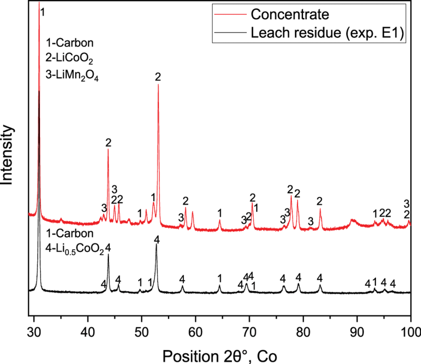
| This graph is an X-ray diffraction pattern, comparing two samples. | このグラフは二つのサンプルを比較したX線回折(XRD)パターンです。 |
| The X-axis represents the angle 2θ, where the X-ray hits the material. | X軸はX線が材料に当たる角度2θを表します。 |
| The Y-axis shows the intensity of the detected X-rays. | Y軸は検出されたX線の強度を示しています。 |
| Peaks on the graph represent the presence of different materials. | グラフ上のピークは異なる材料の存在を表しています。 |
| The red line is for the concentrate and the black for the leach residue. | 赤線は濃縮物用、黒線は浸出残渣用です。 |
| Numbers near peaks match materials listed on the left. | ピークの近くの数字は左にリストされた材料に対応しています。 |
このグラフについて質問する
| Question | 日本語訳 |
|---|---|
| How were the samples prepared before the XRD analysis? | XRD分析の前にサンプルの準備はどのように行われますか? |
| Is the difference in peak height significant? | ピーク高さの違いは有意ですか? |
| How do structural changes in the material affect the peaks observed? | 材料の構造変化は、観測されたピークにどのような影響を与えるのか? |
| Does the carbon content in the concentrate match what we expected? | 濃縮液中の炭素含有量は予想通りか? |
| What could cause the varying peak intensities for LiMn2O4? | LiMn2O4のピーク強度が異なる原因は何でしょうか? |
積み上げ棒グラフ(Stacked bar graph)の説明
| 英語 | 和訳 |
|---|---|
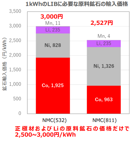
| The bar chart compares material costs for two lithium-ion battery types. | 棒グラフは、2種類のリチウムイオンバッテリーの材料コストを比較しています。 |
| The y-axis indicates cost in yen per kWh, and the x-axis shows the battery types. | y軸はキロワット時あたりのコストを円で示し、x軸はバッテリーの種類を示しています。 |
| NMC(532) is more expensive to make than NMC(811). | NMC(532)はNMC(811)よりも製造コストが高い。 |
| The red segment, indicating cobalt, is the top contributor to NMC(532)’s cost. | 赤のセグメントはコバルトを示し、NMC(532)のコストに最も寄与している。 |
このグラフについて質問する
| Question | 日本語訳 |
|---|---|
| Could you explain why the cost of lithium remains constant across the two battery types? | 2種類のバッテリーにおいてリチウムのコストが一定である理由を説明できますか? |
| How does the reduction in cobalt content in NMC(811) impact their charge cycles? | NMC(811)のコバルト含有量の削減がその寿命と充電サイクルにどのように影響しますか? |
| Is there a trade-off between the material costs and the energy density of the batteries? | 材料コストとバッテリーのエネルギー密度の間にトレードオフはありますか? |
| What steps are being taken to mitigate the high costs associated with nickel in the NMC(811) batteries? | NMC(811)バッテリーにおけるニッケルの高コストを軽減するためにどのような措置が取られていますか? |
| Could you tell us how the lower cobalt use affects making more NMC(811) batteries on a larger scale? | コバルトの使用量が減ることで、より大規模なNMC(811)電池の製造にどのような影響がありますか? |
相関図を説明する
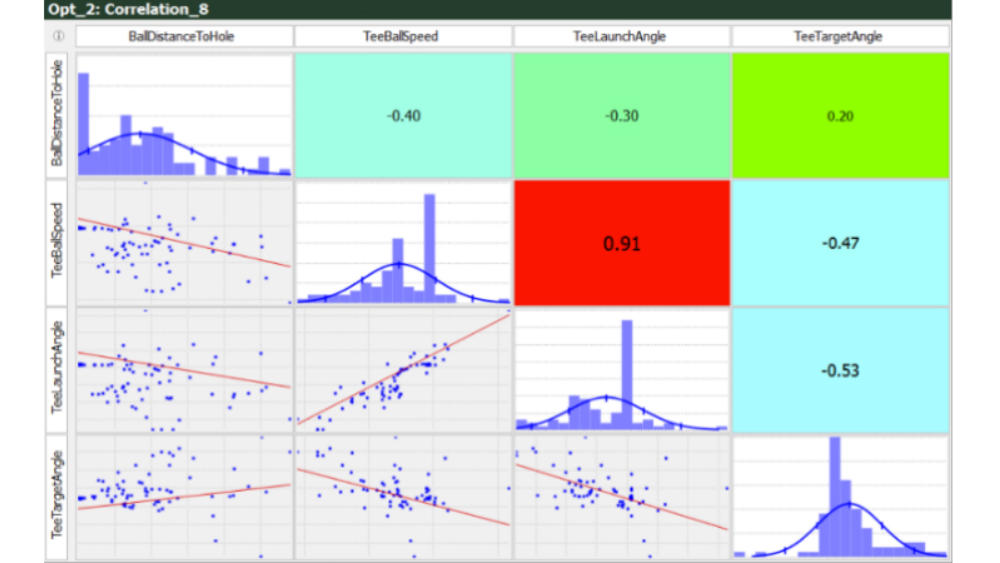
グラフを説明する
| 英語 | 和訳 |
|---|---|
| This image is a pair plot showing relationships between golfing metrics. | この画像はゴルフの指標間の関係を示すペアプロットである。 |
| The histograms on the diagonal show how often each value comes up for a single metric. | 対角線上のヒストグラムは、1つの指標(メトリクス)について、それぞれがどの程度の頻度で出てくるかを示しています。 |
| The colors tell you the type of correlation. | 色によって相関関係のタイプがわかる。 |
| Red indicates a strong positive correlation, blue indicates a strong negative correlation, and green suggests a weak correlation or none at all. | 赤は強い正の相関、青は強い負の相関、緑は弱い相関、またはまったく相関がないことを示す。 |
| In the bottom left, you see “TeeBallSpeed” and “TeeLaunchAngle” have a very high positive correlation of 0.91. | 左下の “TeeBallSpeed “と “TeeLaunchAngle “は0.91という非常に高い正の相関があります。 |
| The top right square is green and has a correlation of 0.20, which is a weak positive relationship. | 右上の四角は緑色で、相関は0.20と弱い正の関係である。 |
グラフについて質問する
| Question | 日本語訳 |
|---|---|
| What factors contribute to the strong positive correlation between TeeBallSpeed and TeeLaunchAngle? | TeeBallSpeedとTeeLaunchAngleの間に見られる強い正の相関に寄与している要因は何ですか? |
| Can you explain why there is a negative correlation between TeeBallSpeed and BallDistanceToHole? | TeeBallSpeedとBallDistanceToHoleの間に負の相関が見られる理由を説明できますか? |
| How reliable are the correlation coefficients displayed on the graph? | グラフに表示されている相関係数の信頼性はどの程度ですか? |
パレートプロット

グラフを説明する
| 英語 | 和訳 |
|---|---|
| The graph shows results from an optimization calculation. | グラフは最適化計算の結果を示している。 |
| Blue dots are successful calculations, while red dots are ones that had errors and couldn’t be calculated. | 青い点は計算に成功したもの、赤い点はエラーが出て計算できなかったものです。 |
| The green square shows the optimal solution that minimises temperature while also minimising mass. | 緑の四角は、温度を最小化しつつ、質量も最小化する最適解を示しています |
| The red dashed curve is called the Pareto front. | 赤い破線の曲線はパレート・フロントと呼ばれる。 |
| Solutions on the Pareto front are better than all others to the right of the curve. | パレート・フロント上の解決策は、曲線の右側にある他のすべての解決策よりも優れている。 |
グラフについて質問する
| Question | 日本語訳 |
|---|---|
| Is there a reason why the blue points naturally concentrate in the lower left region of the graph? | 青い点がグラフの左下領域に自然に集中する理由はありますか? |
| How was the optimal line determined? | 最適な線はどのように決定されたのですか? |
| What does the y-axis represent ? | y軸は何を表していますか? |
三次元グラフ
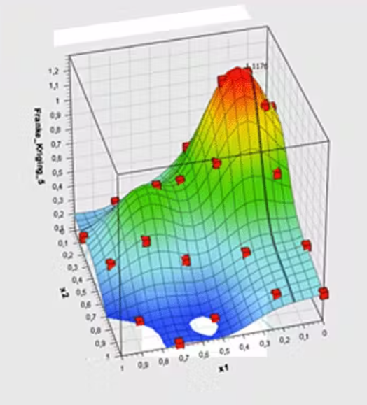
このグラフを説明する
| 英語 | 和訳 |
|---|---|
| This is a 3D surface plot. | これは、3D曲面プロットである。 |
| Areas in yellow and red show where Y is higher, while blue areas have lower Y values. | 黄色と赤色の領域はYがより高く、青色の領域はYがより低いことを示している。 |
| Red dots on the plot represent actual data points. | プロット上の赤い点は、実際のデータ・ポイントを示します。 |
| The peak of the surface, where Y is highest, is marked with a red dot labeled “1.179”. | Yが最も高くなるサーフェスのピークは、”1.179 “とラベル付けされた赤い点でマークされている。 |
このグラフについて質問する
| Question | 日本語訳 |
|---|---|
| Is the peak at the top of the surface indicating an optimal condition or a maximum value? | 表面の頂上にあるピークは、最適な状態または最大値を示していますか? |
| What process was used to create the 3D surface? | 3D表面を作成するためにどのようなプロセスが用いられましたか、 |
| Is this based on experimental data or theoretical calculations? | これは実験データに基づいているのですか、それとも理論計算に基づいているのですか? |
ChatGPTを活用した勉強法
これらグラフの説明と質問の英文、和訳はChatGPTで生成しています。
ご自身の興味のある分野の画像をコピペして、以下のプロンプトで英語・日本語をセットで生成できます。
このグラフを短い複数の英文で説明して。 表現は伝わりやすいようにして。グラフの基本的な見方の説明を多めにして。 和訳とセットで表形式にして。
このグラフをプレゼンした人に対して、気になる点をミーティング中の会話のように質問してみて下さい。 いくつか例を挙げてくれると嬉しいです。表形式にして。
なお、本記事の音声データは、OpenAIのText to Speech機能を用いて生成しています。
文章ごとのリピート音源
いくつか抜粋して、無限リピートできる音源を用意しました。
説明
This graph is a scatter plot that tracks battery life over time under different temperatures.
The x-axis shows depth of discharge in percentage, and the y-axis shows voltage.
This graph is a histogram that shows the distribution of battery cell capacities.
The bar chart compares material costs for two lithium-ion battery types.
This image is a pair plot showing relationships between golfing metrics.
質問
Could you explain why the voltage drop is more gradual compared to the others?
How does temperature affect the result of the experiment?
Are there any plans to test at temperatures below 25°C?
Are there any plans to calculate with current densities greater than 1A/cm2?
試験条件のほとんどは「at」で表現できます。current densityも、curent density at 2 A/cm2のように、あとにつく場合は「at」でよいですが、current densityの前に前置詞が付く場合には「with」がつきます。
Does the battery’s performance correlate directly with these capacity values?
コメント