普段、ブログに掲載しているグラフ類は、Excelで作成して、画像で貼り付けをしていました。
画像データよりも綺麗にグラフを貼り付ける方法として、Javascriptライブラリを用いた方法があります。Google ChartsやChart.js、CanvasJsなどが該当します。ただ、これらをブログに掲載するのは少々面倒でした。
[ad]
Google Chartsを使ったグラフの描画
たとえば、Google Chartsを使うと以下のようなグラフが描画できます。
固体電池に関する特許出願数の累計推移を示したグラフです。
このグラフは、カスタムhtlmに、以下のコードを書くことで実現できます。
<!DOCTYPE html>
<html>
<head>
  <title>Comparison of Patent Applications for Solid State Batteries</title>
  <!-- Load the Google Charts API -->
  <script type="text/javascript" src="https://www.gstatic.com/charts/loader.js"></script>
  <script type="text/javascript">
    // Load the Visualization API and the corechart package.
    google.charts.load('current', {'packages':['corechart']});

    // Set a callback to run when the Google Visualization API is loaded.
    google.charts.setOnLoadCallback(drawChart);

    // Callback that creates and populates a data table,
    // instantiates the line chart, passes in the data and
    // draws it.
    function drawChart() {
      // Create the data table.
      var data = new google.visualization.DataTable();
      data.addColumn('string', 'Year');
      data.addColumn('number', 'Toyota');
      data.addColumn('number', 'Nissan');
      data.addColumn('number', 'Honda');
      data.addRows([
        ['2014', 0, 0, 0],
        ['2015', 69, 0, 2],
        ['2016', 133, 1, 3],
        ['2017', 232, 2, 8],
        ['2018', 319, 4, 9],
        ['2019', 443, 5, 26],
        ['2020', 595, 15, 55],
        ['2021', 695, 34, 90],
        ['2022', 799, 67, 117],
        ['2023', 816, 68, 117]
      ]);

      // Set chart options
      var options = {
        'title':'Comparison of Patent Applications for Solid State Batteries',
        'height':400,
        'legend':{position:'bottom'},
        'vAxis':{title:'Total number of patent applications'},
        'hAxis':{title:'Year'}
      };

      // Instantiate and draw the chart, passing in the options and data.
      var chart = new google.visualization.LineChart(document.getElementById('chart_div'));
      chart.draw(data, options);
    }
  </script>
</head>

<body>
  <!-- Create a div to hold the chart -->
  <div id="chart_div"></div>
</body>
</html>
プログラミングができない私から見ると、
といった悩みに突き当たります。
ChatGPTさんの出番です
面倒なことは全部AIにやってもらう時代なので、ChatGPTにGoogle Charts用のコードを生成してもらいました。
google chartで折れ線グラフを書くためのhtmlコードを書いてください。
・タイトルは「固体電池に関する特許出願数比較」
・縦軸の名称は「累計特許出願数」
・横軸の名称は「年」
・データは以下の通りです
Year Toyota Nissan Honda
2014 0 0 0
2015 69 0 2
2016 133 1 3
2017 232 2 8
2018 319 4 9
2019 443 5 26
2020 595 15 55
2021 695 34 90
2022 799 67 117
2023 816 68 117
上記のようなプロンプトを投げると、Google Chartのコードが返ってきます。(日本語をDeepLで翻訳してからchatGPTに投げています)
データはエクセルなどの表計算ソフトのデータをそのままコピペするだけです。とても簡単。
先ほどの結果を、ホンダのデータだけ示すようなコードに変更してください。
プロットの色はオレンジです。
また、さきほどの結果と同じページに貼りたいので、グラフの名称を変更してください。
修正版として、以下のようなプロットを出してくれました。
  <title>Comparison of Patent Applications for Solid State Batteries - Honda</title>
  <!-- Load the Google Charts API -->
  <script type="text/javascript" src="https://www.gstatic.com/charts/loader.js"></script>
  <script type="text/javascript">
    // Load the Visualization API and the corechart package.
    google.charts.load('current', {'packages':['corechart']});

    // Set a callback to run when the Google Visualization API is loaded.
    google.charts.setOnLoadCallback(drawChart);

    // Callback that creates and populates a data table,
    // instantiates the line chart, passes in the data and
    // draws it.
    function drawChart() {
      // Create the data table.
      var data = new google.visualization.DataTable();
      data.addColumn('string', 'Year');
      data.addColumn('number', 'Honda');
      data.addRows([
        ['2014', 0],
        ['2015', 2],
        ['2016', 3],
        ['2017', 8],
        ['2018', 9],
        ['2019', 26],
        ['2020', 55],
        ['2021', 90],
        ['2022', 117],
        ['2023', 117]
      ]);

      // Set chart options
      var options = {
        'title':'Honda\'s Patent Applications for Solid State Batteries',
        'height':400,
        'legend':{position:'none'},
        'colors':['orange'],
        'vAxis':{title:'Total number of patent applications'},
        'hAxis':{title:'Year'}
      };

      // Instantiate and draw the chart, passing in the options and data.
      var chart = new google.visualization.LineChart(document.getElementById('chart_div2'));
      chart.draw(data, options);
    }
  </script>


  <!-- Create a div to hold the chart -->
  <div id="chart_div2"></div>
Chart.jsを使ったグラフの描画
プロットをChart.jsで描く場合も、同じようなプロンプトで表記できます。
Chart.jsで折れ線グラフを書くためのhtmlコードを書いてください。
・タイトルは「固体電池に関する特許出願数比較」
・縦軸の名称は「累計特許出願数」
・横軸の名称は「年」
・幅は700px
・軸ラベルを表示して。
・各要素の線の色は洒落た感じで。
・コードはなるべく簡潔に。
・データは以下の通りです
Year Toyota Nissan Honda
2014 0 0 0
2015 69 0 2
2016 133 1 3
2017 232 2 8
2018 319 4 9
2019 443 5 26
2020 595 15 55
2021 695 34 90
2022 799 67 117
2023 816 68 117
指定した「各要素の線の色は洒落た感じで。」も生かされていますね。生成されたコードは以下の通りです。
<!DOCTYPE html>
<html>
<head>
    <title>Line Chart Example</title>
    <script src="https://cdnjs.cloudflare.com/ajax/libs/Chart.js/2.9.4/Chart.min.js"></script>
</head>
<body>
    <canvas id="myChart" width="700" height="400"></canvas>
    <script>
        var ctx = document.getElementById("myChart").getContext('2d');
        var myChart = new Chart(ctx, {
            type: 'line',
            data: {
                labels: ['2014', '2015', '2016', '2017', '2018', '2019', '2020', '2021', '2022', '2023'],
                datasets: [{
                    label: 'Toyota',
                    data: [0, 69, 133, 232, 319, 443, 595, 695, 799, 816],
                    borderColor: 'rgb(75, 192, 192)',
                    fill: false
                }, {
                    label: 'Nissan',
                    data: [0, 0, 1, 2, 4, 5, 15, 34, 67, 68],
                    borderColor: 'rgb(255, 99, 132)',
                    fill: false
                }, {
                    label: 'Honda',
                    data: [0, 2, 3, 8, 9, 26, 55, 90, 117, 117],
                    borderColor: 'rgb(54, 162, 235)',
                    fill: false
                }]
            },
            options: {
                title: {
                    display: true,
                    text: 'Comparison of the number of patent applications for solid state batteries'
                },
                scales: {
                    yAxes: [{
                        scaleLabel: {
                            display: true,
                            labelString: 'Total number of patent applications'
                        }
                    }],
                    xAxes: [{
                        scaleLabel: {
                            display: true,
                            labelString: 'Year'
                        }
                    }]
                }
            }
        });
    </script>
</body>
</html>
CanvasJsでのグラフの描画
CanvasJsでも、同じようにコード出力が可能です。
canvasjsで折れ線グラフを書くためのコードを書いてください。
・タイトルは「固体電池に関する特許出願数比較」
・縦軸の名称は「累計特許出願数」、横軸の名称は「年」
・幅は指定しない,高さは500px
・横軸は自然数です
・軸ラベルを表示して。各要素の線の色は洒落た感じで。コードはなるべく簡潔に。
・データは以下の通りです
Year Toyota Nissan Honda
2014 0 0 0
2015 69 0 2
2016 133 1 3
2017 232 2 8
2018 319 4 9
2019 443 5 26
2020 595 15 55
2021 695 34 90
2022 799 67 117
2023 816 68 117
このグラフを作成したコードは以下の通りです。
<!DOCTYPE html>
<html>
<head>
<title>Line Chart Example</title>
<script src="https://canvasjs.com/assets/script/canvasjs.min.js"></script>
</head>
<body>
<div id="chartContainer2" style="height: 500px;"></div>
<script>
var chart = new CanvasJS.Chart("chartContainer2", {
title: {
text: "Comparison of the number of patent applications for solid state batteries"
},
axisX: {
title: "Year"
},
axisY: {
title: "Total number of patent applications"
},
data: [{
type: "line",
name: "Toyota",
dataPoints: [
{ x: 2014, y: 0 },
{ x: 2015, y: 69 },
{ x: 2016, y: 133 },
{ x: 2017, y: 232 },
{ x: 2018, y: 319 },
{ x: 2019, y: 443 },
{ x: 2020, y: 595 },
{ x: 2021, y: 695 },
{ x: 2022, y: 799 },
{ x: 2023, y: 816 }
],
color: "rgb(75, 192, 192)"
}, {
type: "line",
name: "Nissan",
dataPoints: [
{ x: 2014, y: 0 },
{ x: 2015, y: 0 },
{ x: 2016, y: 1 },
{ x: 2017, y: 2 },
{ x: 2018, y: 4 },
{ x: 2019, y: 5 },
{ x: 2020, y: 15 },
{ x: 2021, y: 34 },
{ x: 2022, y: 67 },
{ x: 2023, y: 68 }
],
color: "rgb(255, 99, 132)"
}, {
type: "line",
name: "Honda",
dataPoints: [
{ x: 2014, y: 0 },
{ x: 2015, y: 2 },
{ x: 2016, y: 3 },
{ x: 2017, y: 8 },
{ x: 2018, y: 9 },
{ x: 2019, y: 26 },
{ x: 2020, y: 55 },
{ x: 2021, y: 90 },
{ x: 2022, y: 117 },
{ x: 2023, y: 117 }
],
color: "rgb(54, 162, 235)"
}]
});
chart.render();
</script>
</body>
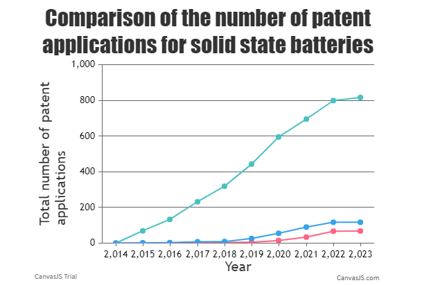
</html>CanvasJsは有償ライブラリのため、作成されるコードはすべてトライアルであり、グラフにもキャプションが表記されます。
CanvasJsは、グラフの見た目はいい感じなのですが、以下のような気になる点もあります。
これらを修正するために、以下のように指示してみます。
コードの行数を減らせない?dataPointsのところとか、書き方工夫したら?
横軸の数値、三桁ごとのカンマ区切りになってるのを、普通の表示にしてくれる?
凡例を表示するようにして
この指示で修正されたグラフが以下の通りです。
いい具合に修正できました。
<!DOCTYPE HTML>
<html>
<head>
	<script src="https://canvasjs.com/assets/script/canvasjs.min.js"></script>
	<script>
		window.onload = function () {
			var chart = new CanvasJS.Chart("chartContainer", {
				animationEnabled: true,
				title:{
					text: "Comparison of the number of patent applications for solid state batteries"
				},
				axisX: {
					title: "Year",
					interval: 1,
					labelFormatter: function (e) {
						return CanvasJS.formatNumber(e.value, "####");
					}
				},
				axisY: {
					title: "Total number of patent applications"
				},
				legend: {
					cursor: "pointer",
					itemclick: function(e) {
						if (typeof(e.dataSeries.visible) === "undefined" || e.dataSeries.visible) {
							e.dataSeries.visible = false;
						}
						else {
							e.dataSeries.visible = true;
						}
						chart.render();
					}
				},
				data: [{
					type: "line",
					color: "rgb(75, 192, 192)",
					showInLegend: true,
					name: "Toyota",
					dataPoints: []
				},
				{
					type: "line",
					color: "rgb(255, 99, 132)",
					showInLegend: true,
					name: "Nissan",
					dataPoints: []
				},
				{
					type: "line",
					color: "rgb(54, 162, 235)",
					showInLegend: true,
					name: "Honda",
					dataPoints: []
				}]
			});

			var data = [
				{ label: "Toyota", color: "rgb(75, 192, 192)", data: [0, 69, 133, 232, 319, 443, 595, 695, 799, 816] },
				{ label: "Nissan", color: "rgb(255, 99, 132)", data: [0, 0, 1, 2, 4, 5, 15, 34, 67, 68] },
				{ label: "Honda", color: "rgb(54, 162, 235)", data: [0, 2, 3, 8, 9, 26, 55, 90, 117, 117] }
			];

			for (var i = 0; i < data.length; i++) {
				for (var j = 0; j < data[i].data.length; j++) {
					chart.options.data[i].dataPoints.push({ x: 2014 + j, y: data[i].data[j] });
				}
				chart.options.data[i].color = data[i].color;
				chart.options.data[i].name = data[i].label;
			}

			chart.render();
		}
	</script>
</head>
<body>
	<div id="chartContainer" style="height: 500px"></div>
</body>
</html>
まとめ
Google ChartsやChart.js、CanvasJsでのグラフ描画は、ChatGPTさんがお得意です。
今回使った中では、無償のChart.jsでグラフを描画するのが、使い勝手がよさそうに感じました。
プログラムの知識がなくても生きていける時代になってきましたね。
関連記事

コメント